Close to Home
While not born or raised here in Midland, I think it’s safe that I now pridefully call myself a local, with 8 years living here with my family. So, when I was approached to revitalize one of the Town’s oldest homes, I was excited - yet a bit nervous - at the prospect to be part of this transformation. My focus has been predominantly towards contemporary architecture, but I felt in my gut that if I did this right, I could help potentially preserve and protect a heritage home that locals have been familiar with their whole lives.
THE CONCEPT
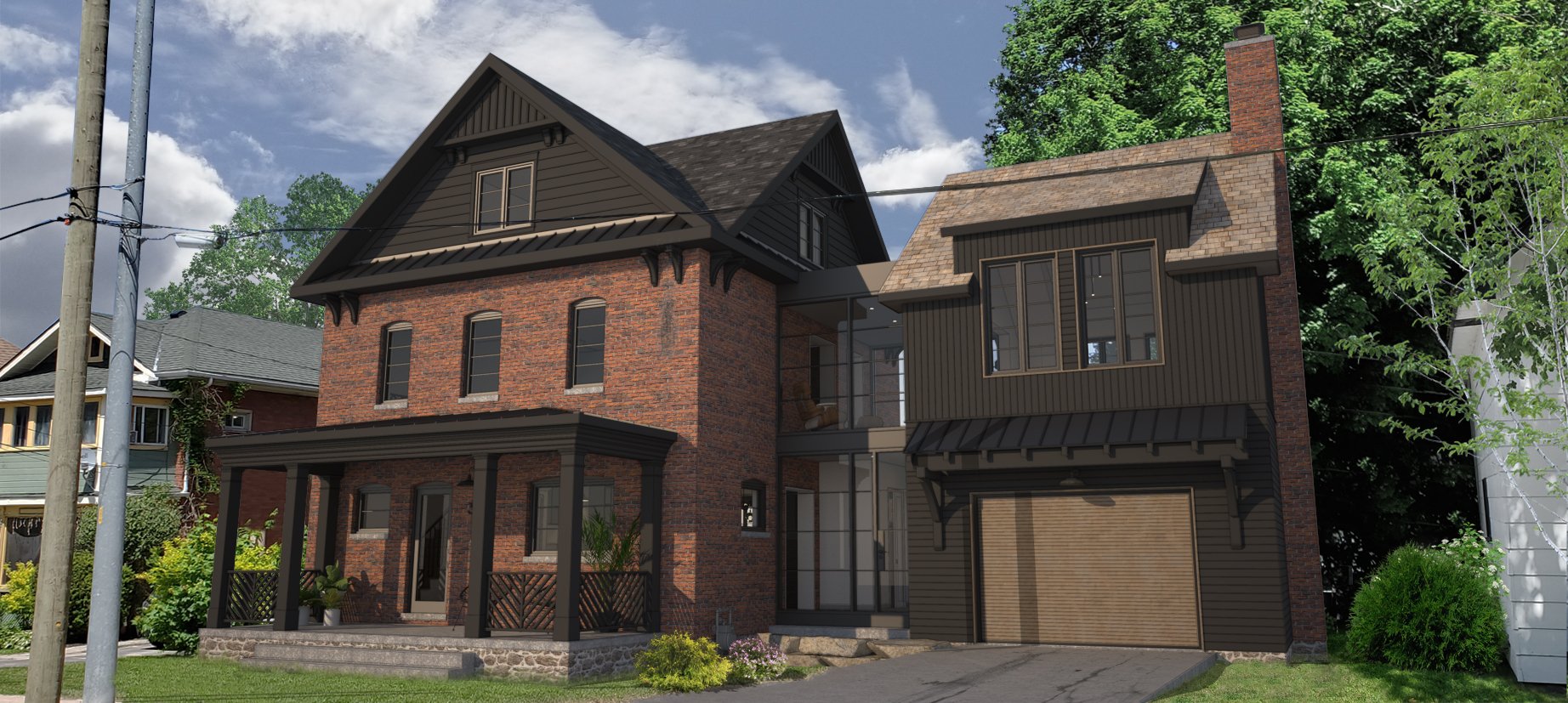
Our goal was to maintain as much of the existing recognizable features as possible and create an addition that respects and compliments the architectural time period and character. Not only was this a challenge visually, but what was removed and put back had to meet the current zoning by-laws, and the original structure predates the existence of these requirements. The front and rear covered porch were staples with this style house, but a poorly built rear addition, and crumbling front porch meant that these items needed to be removed, reimagined and reconstructed within the existing footprint.
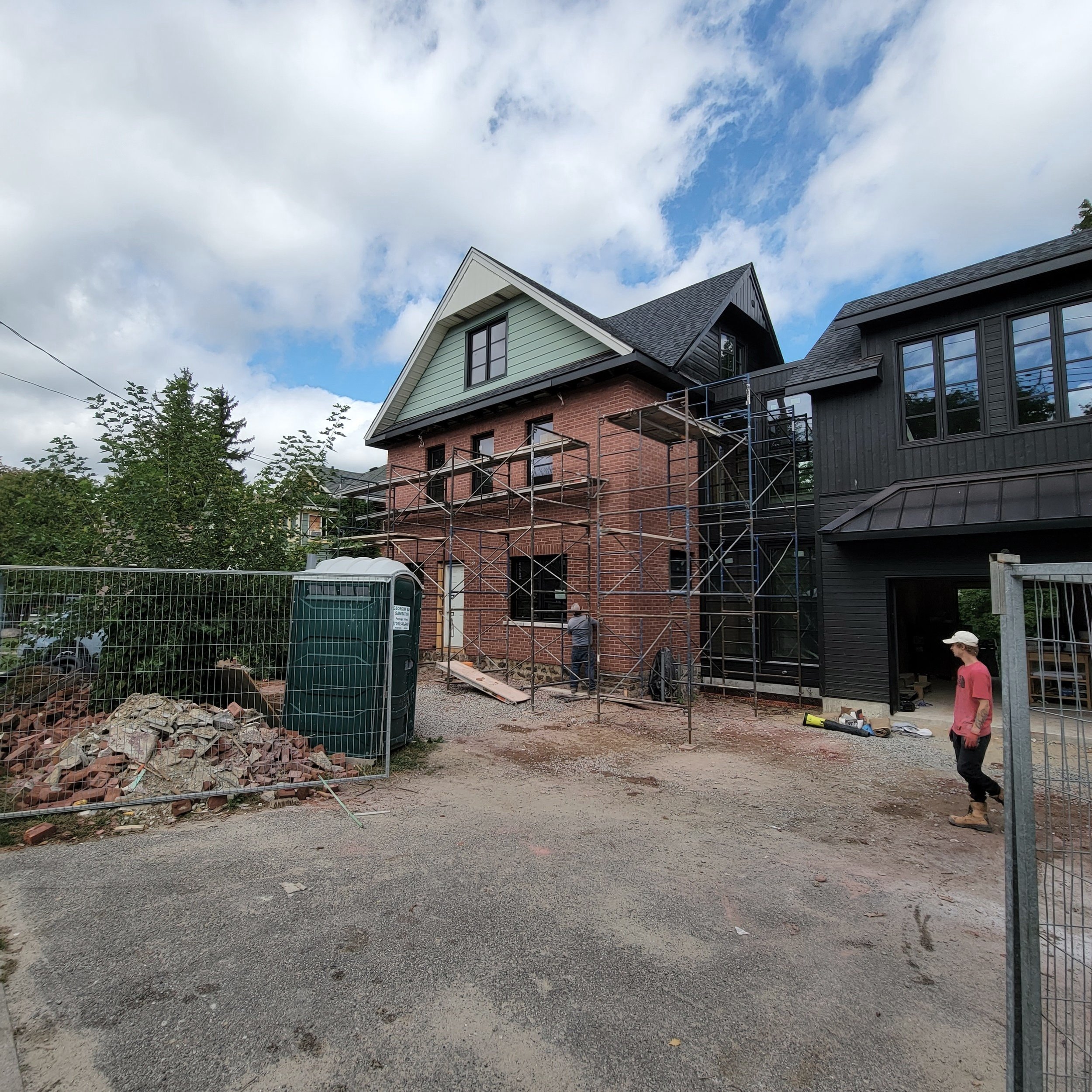
I chose a simple colour palette, with red brick as the dominant exterior feature, alongside several darker features that lend to a classic Daymark approach. To compliment the original massing and updates to the main facade, I decided to visually detach the 2-storey addition with a modern glazed link, and treat exterior elements that weren’t brick with a matching black or wood palette.
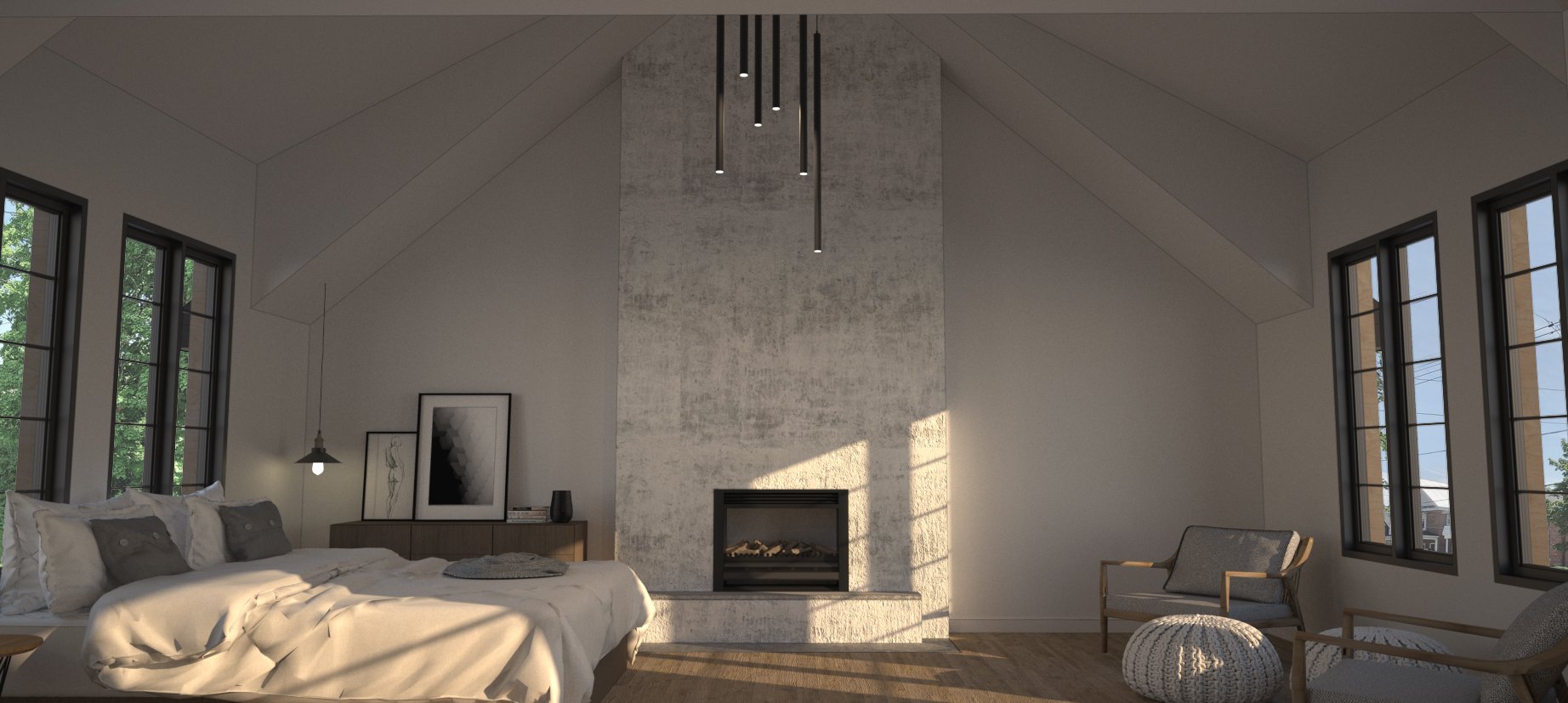
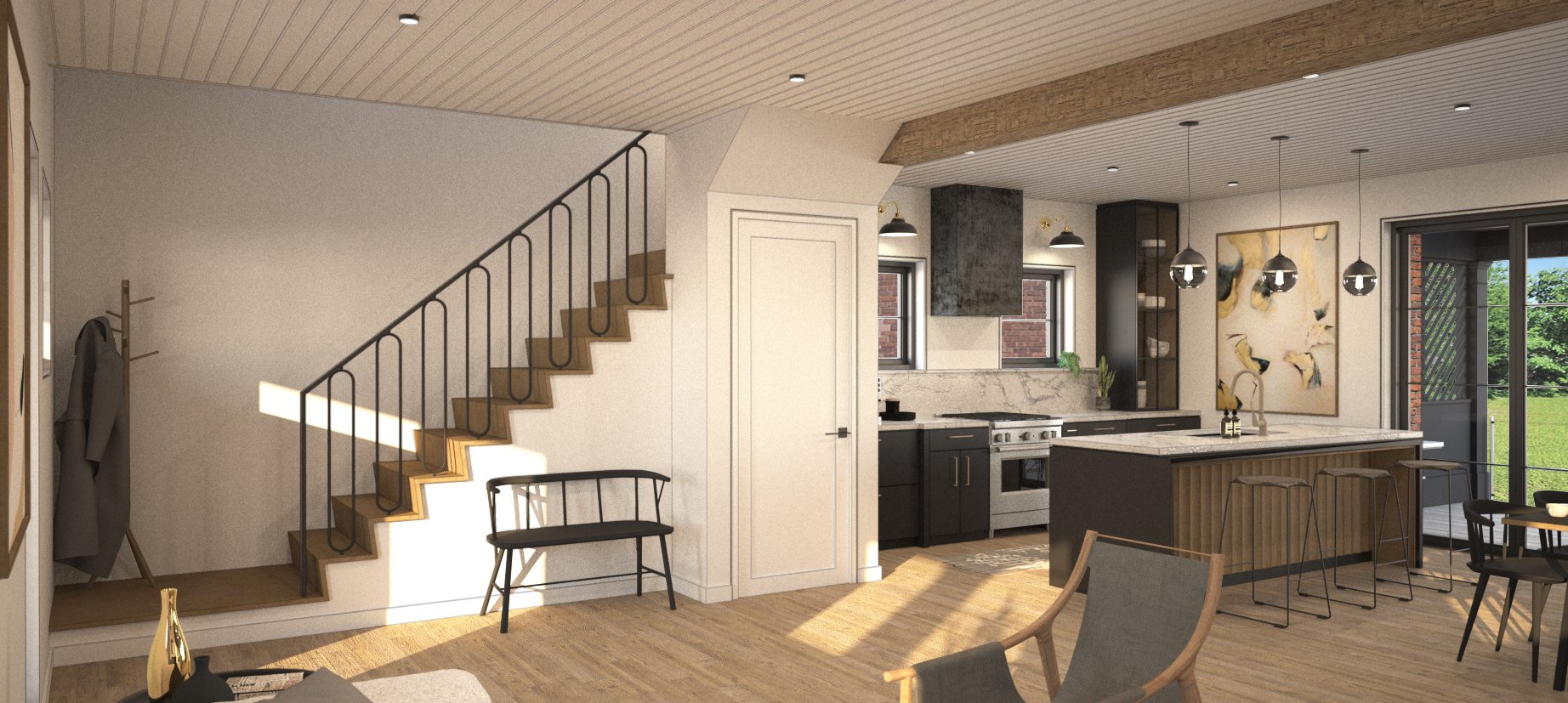
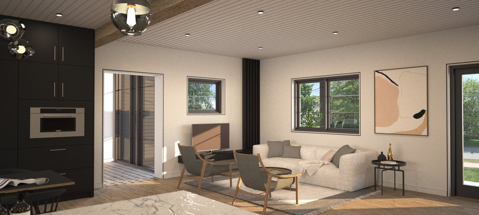
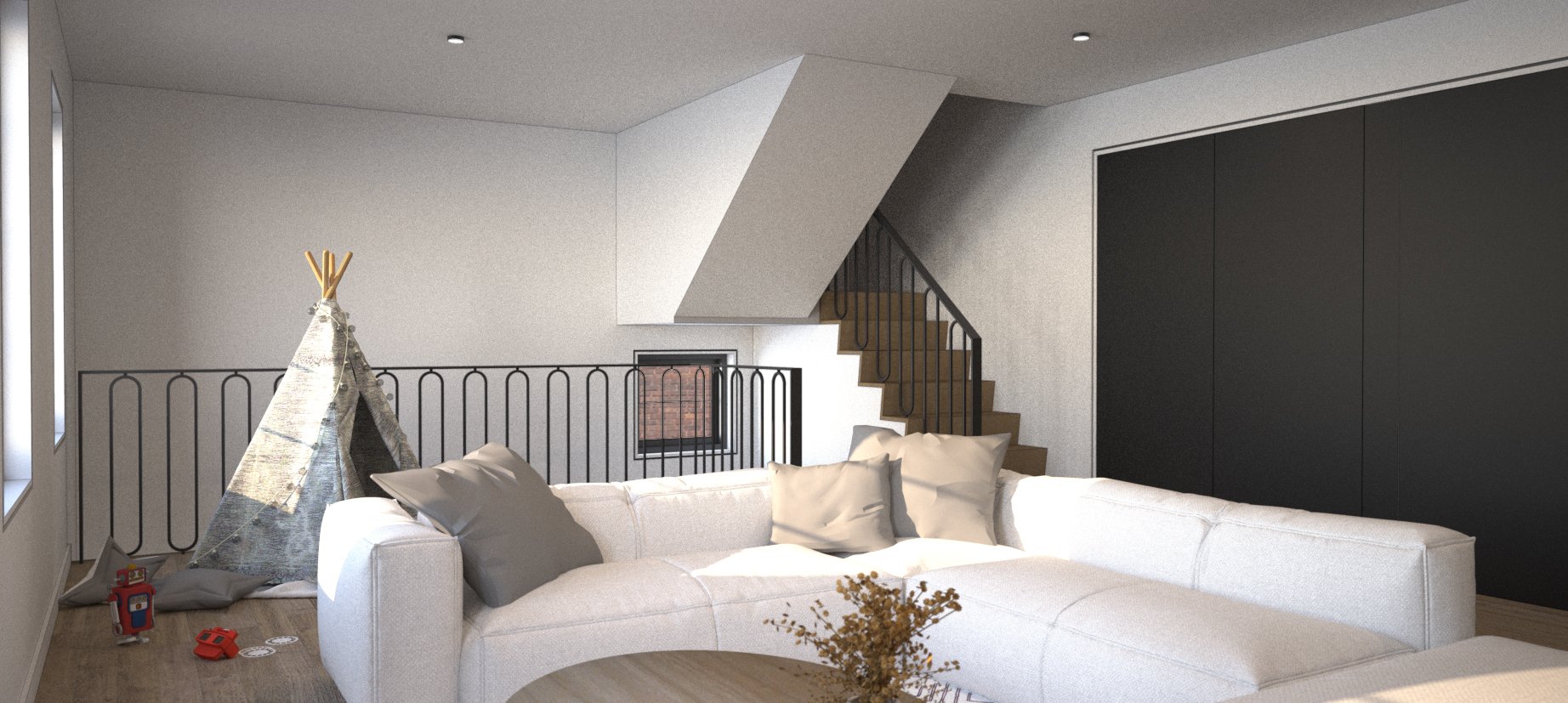
Moving to the interior, I chose a more neutral palette, mixing black, whites, greys and the warmth of wood, to keep things simple but elegant - an extension from exterior to interior.
DEMOLITION
News paper discovery from 1918
Over a year passed, building permits in-place, a contractor retained and a project scheduled to start in the middle of a global pandemic, the construction industry was irreversibly impacted - and a sensitive project that was always a challenge was now teetering on impossible.
Design is fun on it’s own, but I am very conscious to only undertake projects that my client and I can agree are committed and feasible to realizing the ultimate build. For this project, the pandemic through a real curve ball and things changed since our first conversation together. Material prices increased, trade availability was now limited, and a predictable timeline was now out the window.
Enter resilient owners, with an iron clad stomach, and an unbreakable will. Again, grateful is not a big enough word to describe how I feel about Daymark’s clientele. Undoubtedly, there will be changes - what they are and how they will be encountered through the construction process will be interesting.
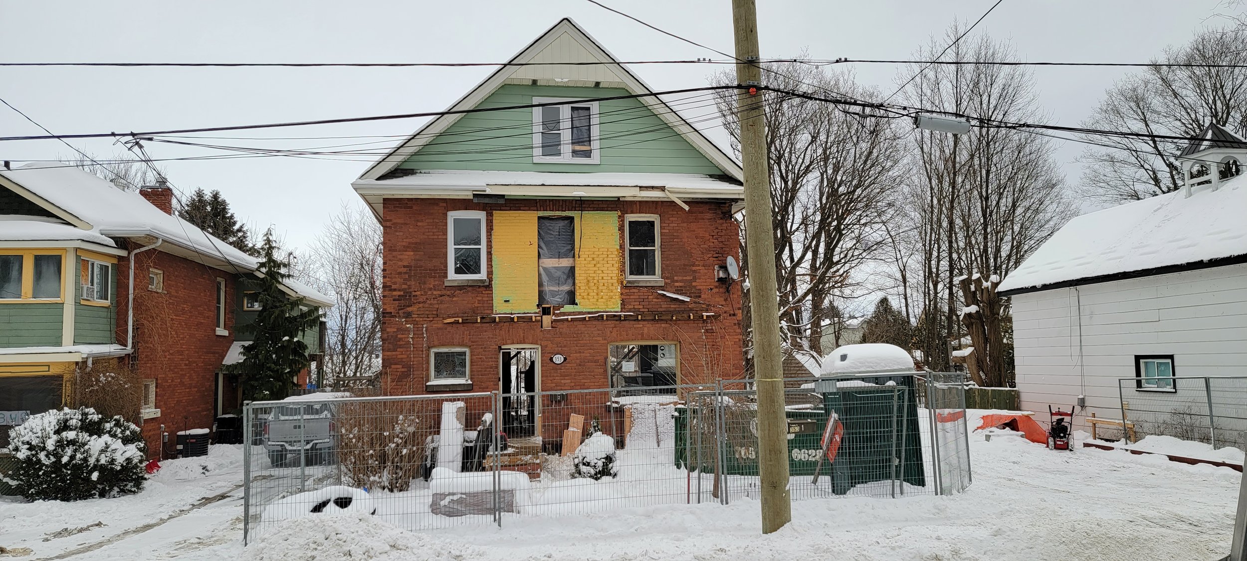
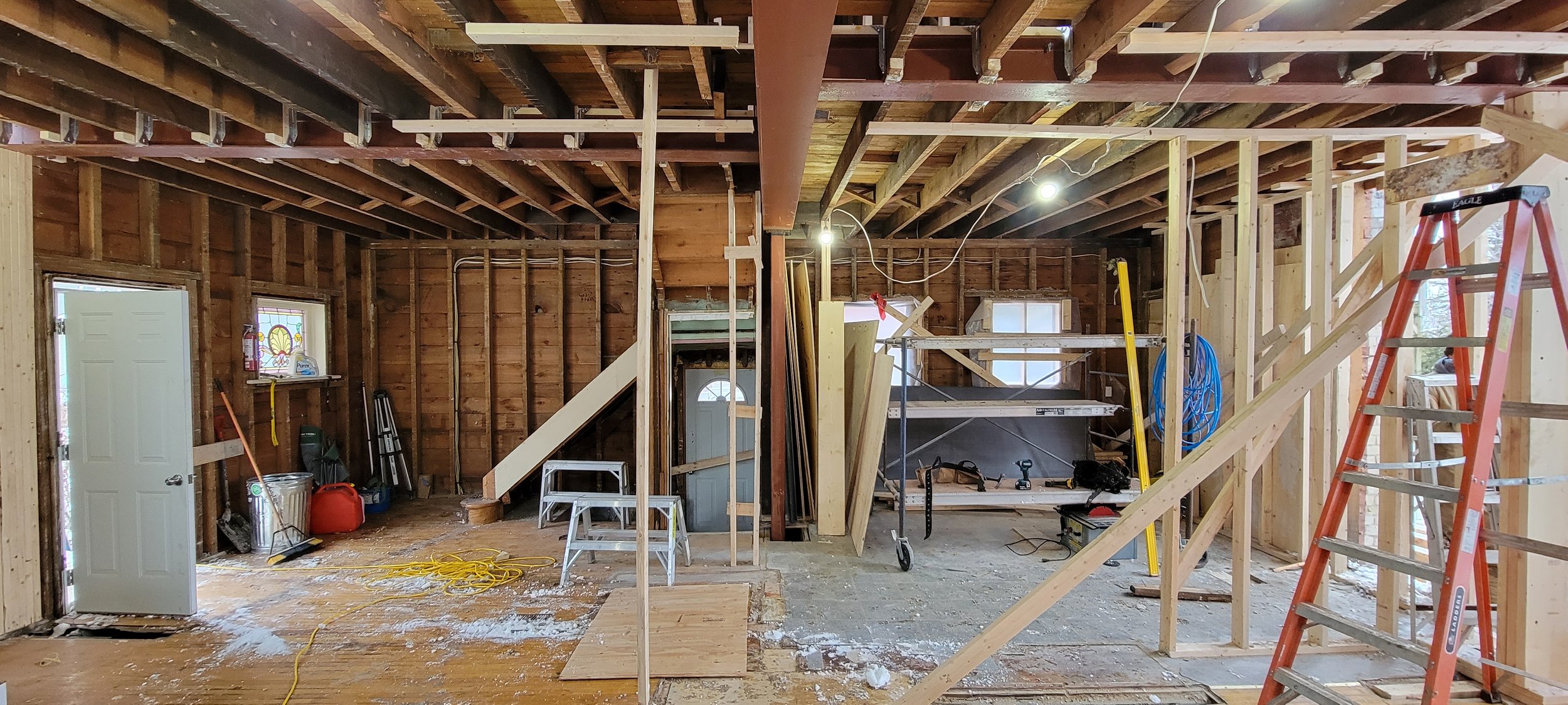
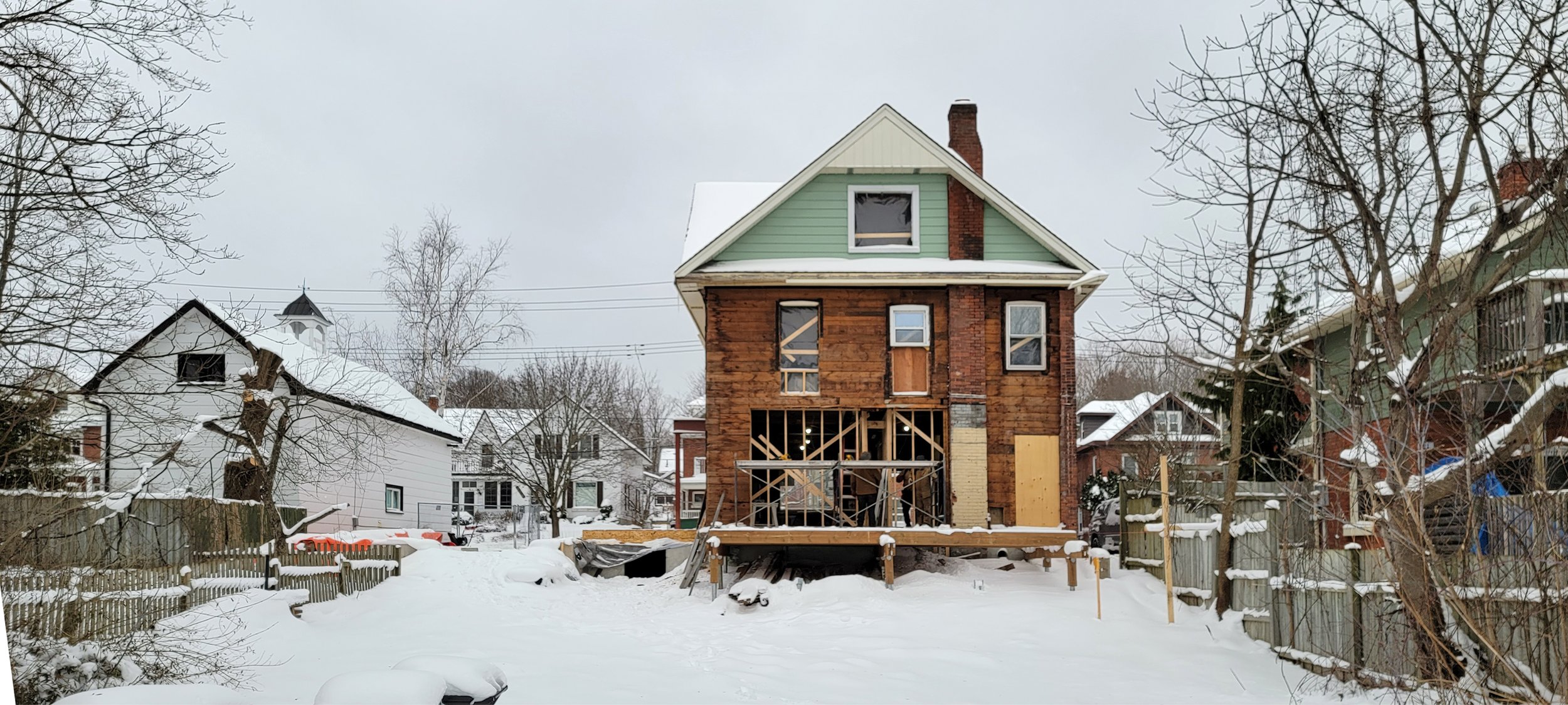
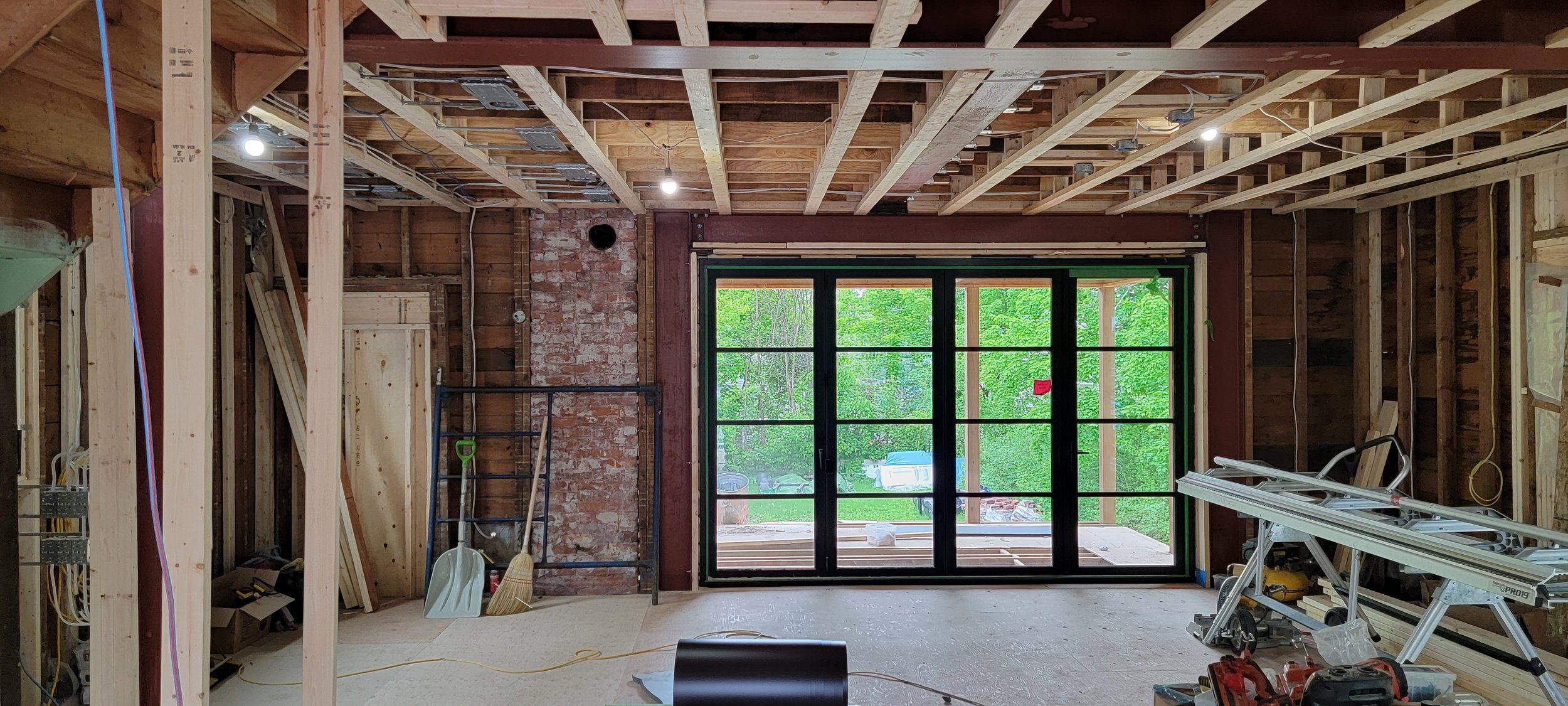
Once demolition was underway and the interior stripped bare, the soul of the house was exposed. Dangerously unsupported masonry walls began to fall, the house literally swayed in the wind, and trades refused to work until confidence was put back into structural stability. New steel beams, columns and angles were installed, walls laterally supported, joists sistered and unsafe conditions removed. The most gut-wrenching one for me personally was when existing bricks were removed from 3 of the exterior façade’s and saved on palettes for reinstallation. This was a no turning back moment for us.
OUT OF THE GROUND
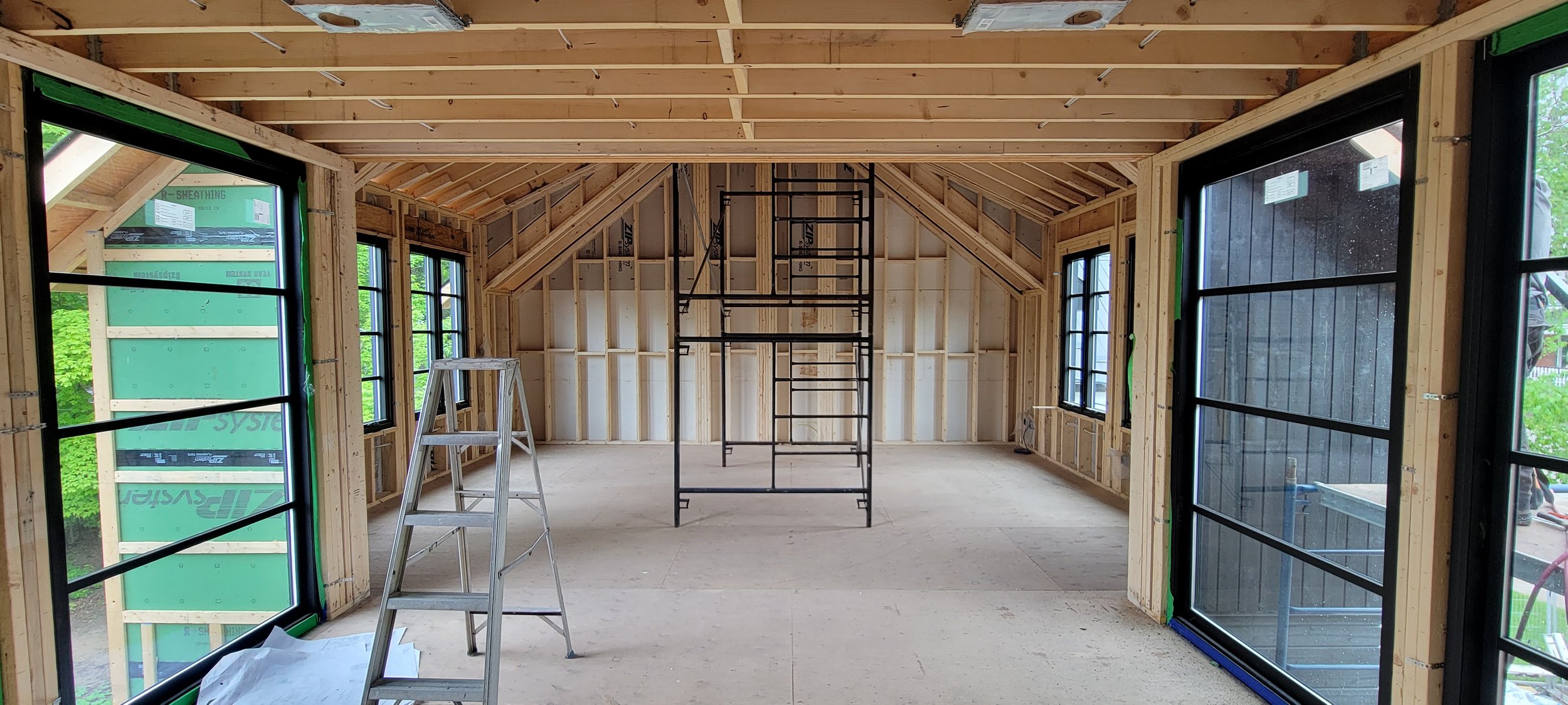
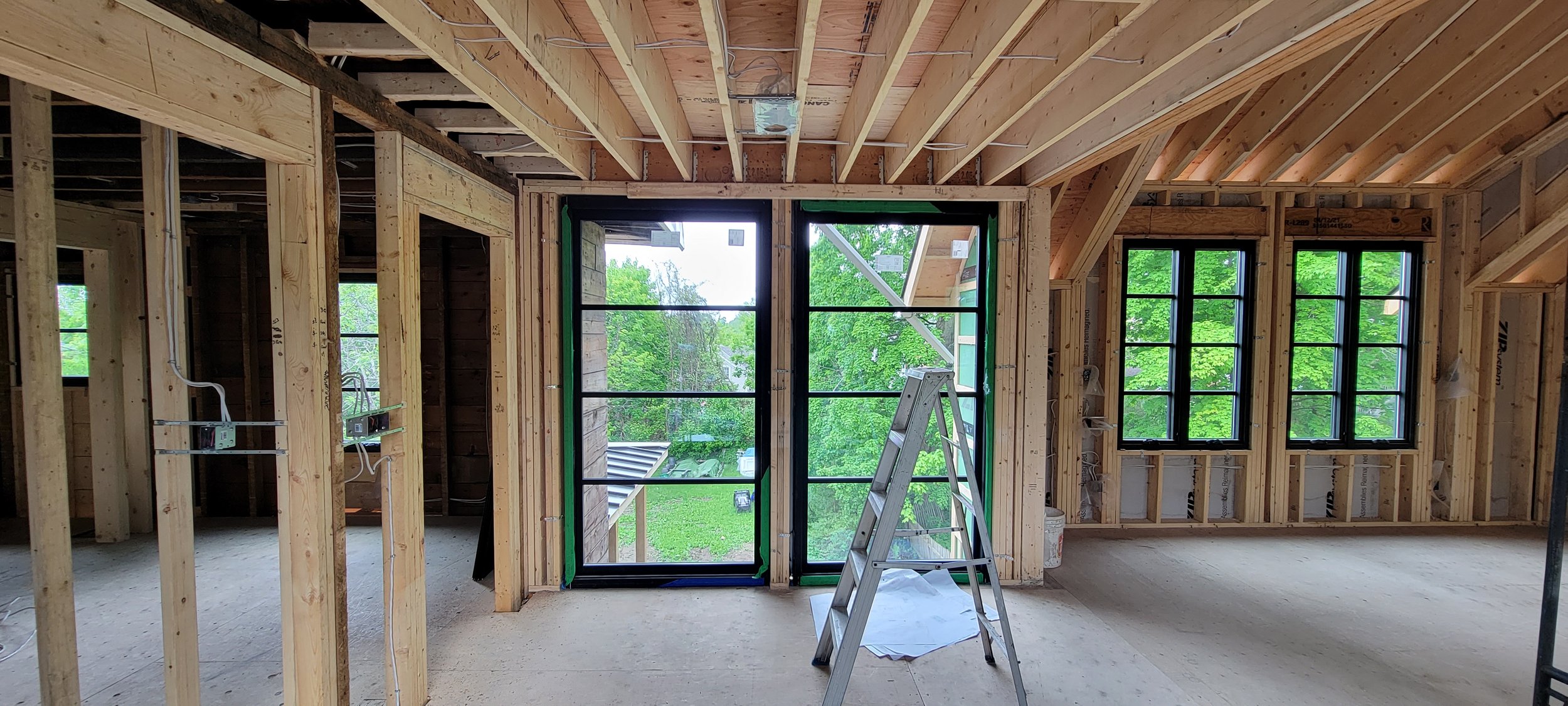
Having encountered so many challenges during demolition, it was encouraging to see the project out of the ground and fully framed, wrapped and standing proud. On this project we employed zip r-sheathing, a new product in North America that integrates continuous insulation, exterior sheathing and weather resistive barrier - it can be a real time saver and luckily it’s straightforward for trades to work with. A win-win! Also captured here are the windows - I was surprised at the speed they were received on this project, with anywhere from 4 to 8 month delays on fenestrations being seen with majority of other projects.
CHANGES
One of the first changes noticed on site was the movement away from wood in multiple locations due to increased cost. Wood shake roof, exposed timber framing, garage door and wood soffits have been switched out for more readily available and cost-conscious selections.
The soul of the design remains intact. Small tweaks like this have become the norm with pandemic construction, and I imagine I’ll continue to see these sorts of changes on all of Daymark’s projects until the industry can balance itself.
The contractor and crew have a great positive attitude and smooth over my expressed concern, whenever potential revisions crop up.
GIVING ME THE FEELS
The essence of this house is now fully in place, and the ability to stand inside and take it all in, gives me all the right feelings. I can see a family inside these walls, sharing meals with friends and relatives, where children can play and everyone has a warm and inviting shelter to rest their heads at night. It just feel right.
Some seriously extensive and large steel members were installed - a bit of structural gymnastics carried out, to provide an open modern space within the walls of a traditional home that were once completely broken up by individual rooms. While I can see potential in any space before pen even hits paper, nothing will ever beat standing inside a space and taking it in with your senses. Drawings, renderings and models are effective for illustrating what it can be, but living the experience gives all the feels, in a different way.
CLADDING AND INSULATION
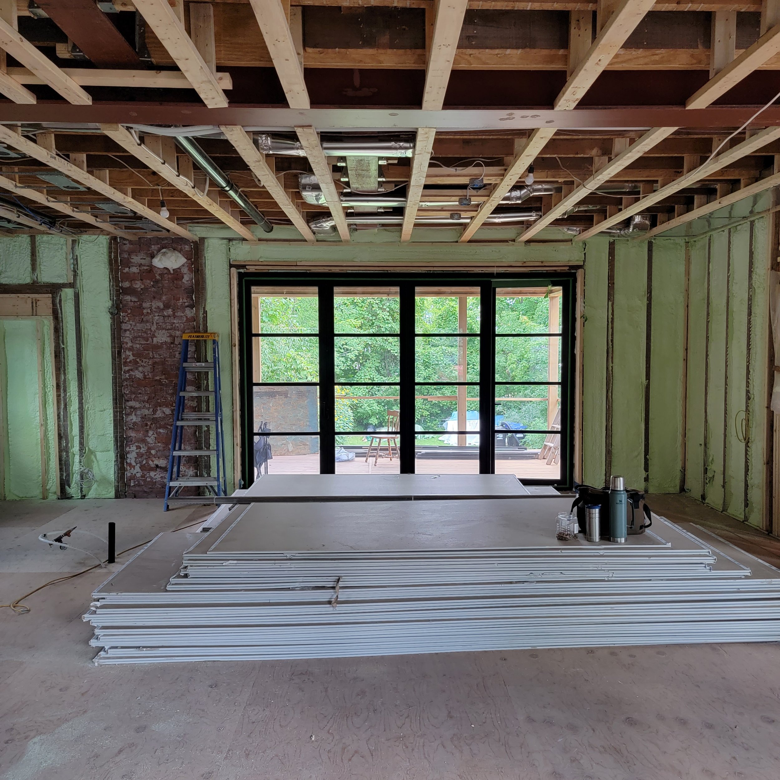
As we make our way toward the fall, children are back in school, and leaves are starting to change as it get colder, the exterior cladding is almost complete and the interior is insulated. The finishing stages will commence in short order, with gypsum wall board noted at each floor level. With the brick back in place - thanks to a very patient mason - the front porch foundations and framing will commence providing the piece that will tie the front elevation together. Before we know it, spring will be on our doorstep, with exciting updates and photos for this classic reno in the heart of the community I call home. Stay tuned!

